Advertising disclosure
Hosting Canada is community-supported. We may earn a commission when you make a purchase through one of our links. Read Disclosure.
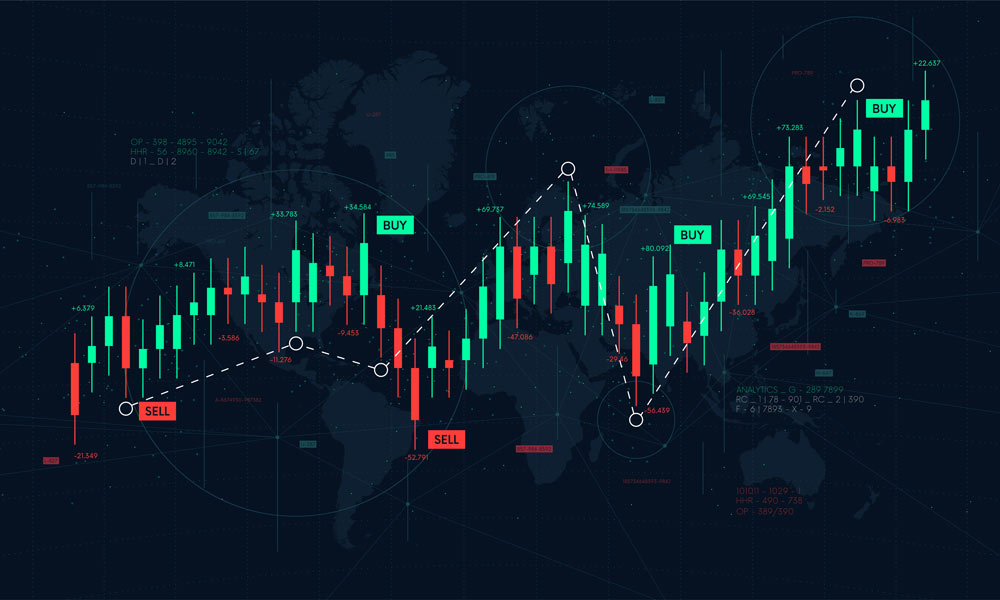
How To Read Stock Charts


 Stock trading has been a thing for well many, many decades now, but it hasn’t always really been accessible to the average person.
In the 80s and 90s, the only real way to take part in stock trading was to either have a seat in a stock market, or hire somebody who has a seat there to do it for you.
Not only that, but for the most part people just let stock investors do their own thing with their investments, with the hope that they end up doing good trades and make them some good money.
Thankfully, starting in the 2000s and going into the 2010s, stock trading started becoming more accessible. With the proliferation of computers, and high-speed internet, it was suddenly pretty easy for anybody to find their way into a stock market and start trading stocks.
Whether it’s a physical stock market like NASDAQ or something a bit more ethereal like FOREX, stock market trading has been something that more and more people have been getting into.
What is a Stock Chart?
Before you start investing in the stock market though, our Hosting Canada team has prepared a guide on a a very important tool that you have to understand before embarking on this journey.
The stock chart is the basic tool that you’ll need to get started with stock trading. It essentially gives you a quick and easy way to see how a specific stock is doing. Trends, it’s maximums and minimums, how it’s performed over different periods of time, all of that is really easy to consume and process through a stock chart.
Before getting into the specifics of how to read one though, we do need to cover the different types of stock charts:
Different Types of Stock Charts
Bar Chart
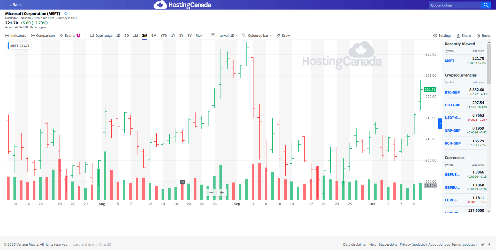
The first and most common chart to read is the Bar chart, otherwise known as HLC/OHLC. It’s made to show you 4 pieces of information: High of the day, low of the day, closing price and optionally opening price. This is the chart we’re going to be using today since it’s the standard, but pretty much all charts follow similar types of information
Candlestick Chart
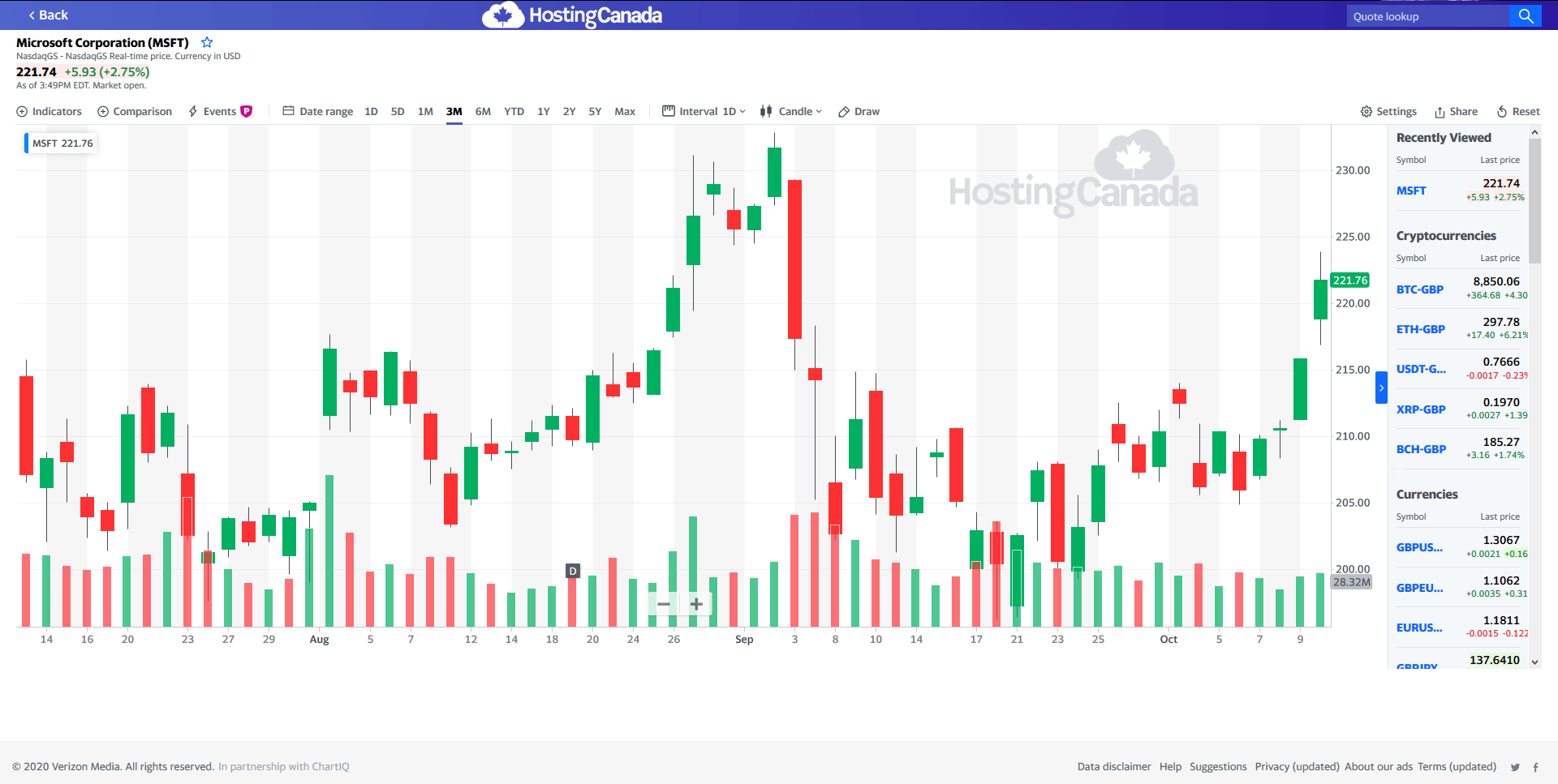
The Candlestick chart shows the same four pieces of information as the bar chart, but with a slightly different format. The small lines show the price range from high to low, while the wider area, known as “real body” shows the range from opening to closing. If the closing is lower than opening it’s red, and vice versa.
Line Chart
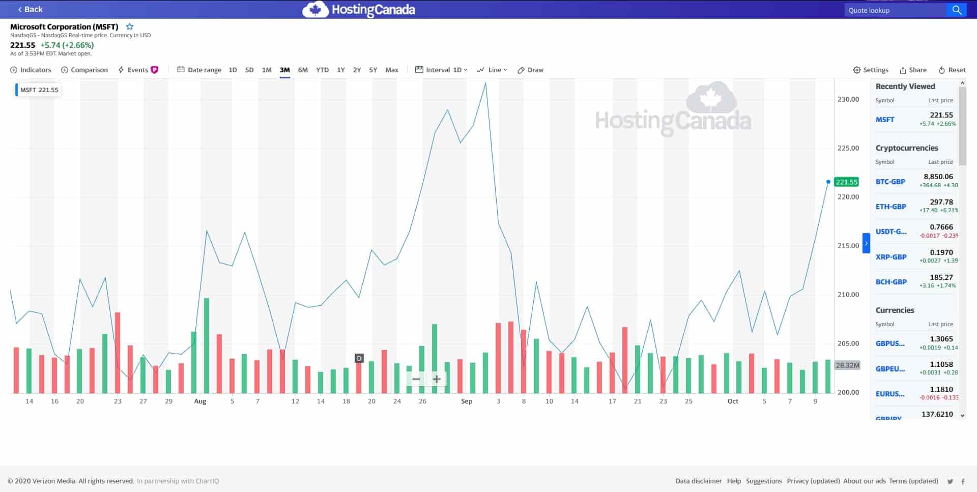
A more simple chart, the line chart basically just tracks the closing price for each day and the lines gives a visual representation between peaks and troughs. Some traders think the closing price is most important, so that’s what they use, and it is an easy way to get an idea of performance of a stock.
How to Read a Stock Chart
The first thing to know is that there are tons of different sites out there that provide stock charts, and each one does things a little bit different. That being said, they all generally have the same components, so even though we’ll explain one specific type of chart, it applies to all the charts.
Also, you’ll have noticed so far that we’ve been using the Yahoo! Finance charts because they’re pretty useful, but some other sites you can checkout are Makebeat, Bar Chart, and Stock Charts.
Different Parts of a Stock Chart
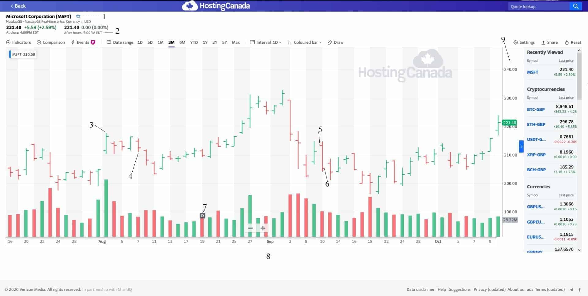
📌1: The most important part of any stock chart is the stock that we’re looking at itself. In this case, we’ve been using Microsoft Corporation stocks for the chart, and their symbols in the NASDAQ are MSFT.
📌2: The next section includes their opening and closing prices, usually for the day. As you can see here, the stock price in closing was higher than in opening for the day this image was taken.
📌3: The top of the bar is the highest price that stock reached that day.
📌4: The bottom part of the bar is the lowest price that stock reached that day.
📌5: The line pointing to the left is the opening price of the stock on that day.
📌6: The line pointing to the right is the closing price of the stock on that day.
📌7: This differs from chart to chart, but usually a letter at the bottom signifies a dividend, which is money the company has chosen to give back to stockholders. In this case if you expand the time range of the chart over the course of a year, you’ll see they payout dividends every quarter.
📌8: Speaking of time range, this is the time period shown in the chart, which you can usually expand or contract pretty easily using the settings buttons.
📌9: This is the price set on the Y axis of the chart, so you know what the bars and lines signify.
Bars at the bottom: The green and red bars at the bottom signify the volume of trade.
And that’s it – relatively simple to look at and get a ton of information from just a quick glance.
Understanding a Stock Chart
In this section we will be looking at the most important concepts of a stock chart. Since we covered volume last in the previous section, we will consider it at the beginning of this one.
Volume
Volume tells you how much of a stock has been traded on any specific day and is an important signifier to tell you how risky it is to trade in a specific stock. This is because if there is a high amount of volume, then it’s easy for you to buy and share stocks if you want.
On the flip side, if there’s low volume, as is the case with penny stocks or smaller companies in general, there might not be a lot of people buying and selling, so don’t count too much on either happening at a specific price point.
Resistance and Support
Another important concept to understand is resistance and support, which is essentially a channel within which a stock doesn’t really move up or down out of in any given period. Usually that period is 50 days and is known as the ‘50 Day Moving Average’ or 50 DMA.
If we go back to our chart with an expanded view, we will be able to see some channels of resistance and support over the previous year:
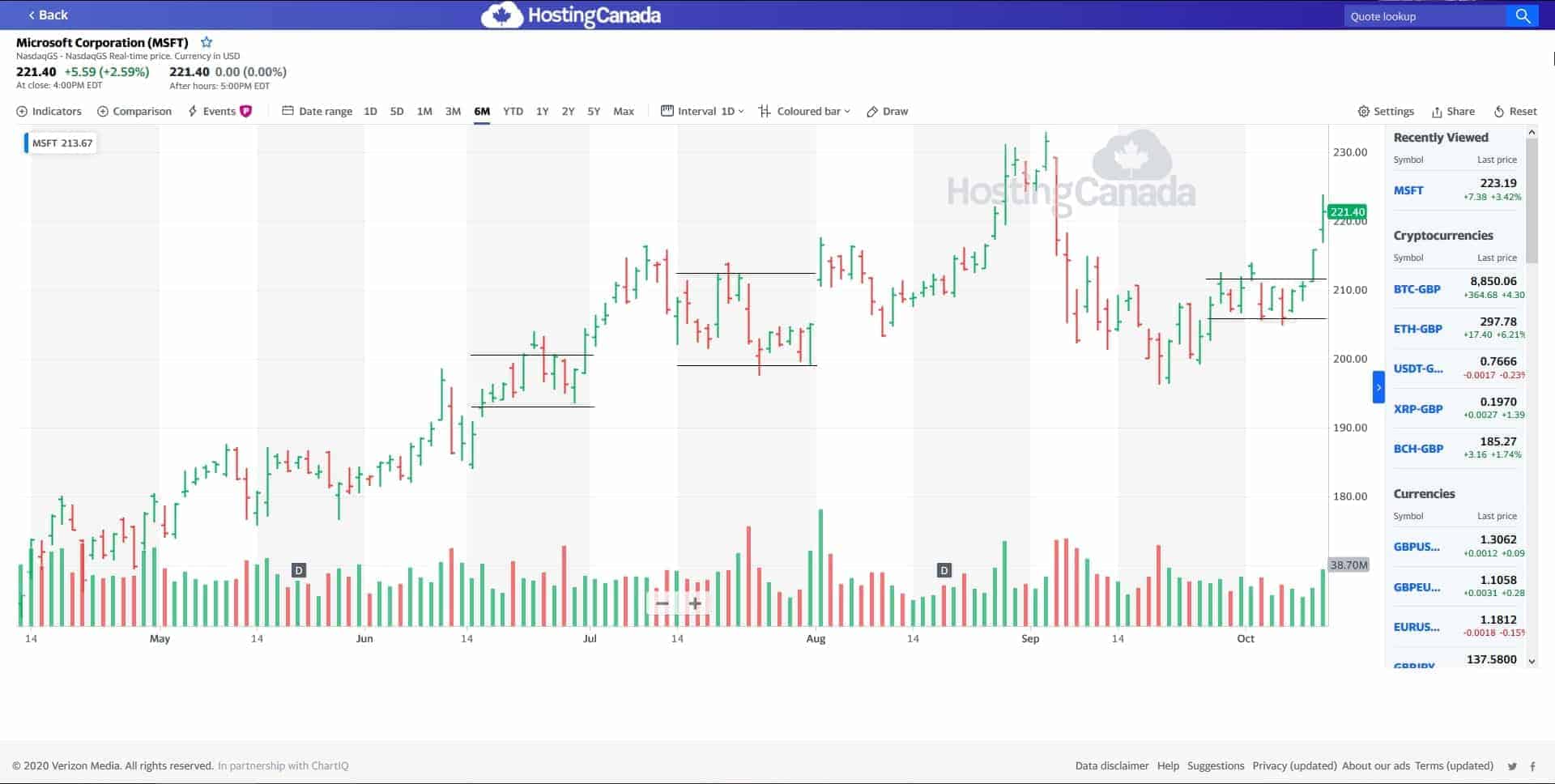
The idea behind this concept is to know when to buy and when to sell. Ideally, you never want to buy when the stock is at the top of the channel, or resistance, and you do want to buy when it’s at the lowest and of the channel, or the support.
So how do you figure out the channel? Well, it’s complicated and really requires a lot of guess work. We can identify it here because we have the history of the stock and its easy to see.
On the other hand, being good at figuring out the patterns and channels is how some people make tons of money in the stock market.
Dividends
We have already touched upon dividends lightly, but basically a dividend is an amount of money given back to stockholders. The thing is, not all companies give out dividends at all, preferring to take their profit and reinvest it into the business.
This can make sense in terms of long-term planning and making the stock more attractive, and there’s still lots of good reasons to invest in a company’s stock, even if it’s as a long-term investment for the future.
Splits
This is something we haven’t seen in the chart so far, but is something you should be aware of. Basically, a split is something a company can do to create a larger amount of shares for sale.
This tends to help make the shares cheaper and therefore more attractive for people to invest who might not have the thousands required to invest in the more expensive stocks.
What about your stocks though, do they lose value? Thankfully not. What usually happens is that companies will split a stock according to a ratio, say 5:1.
That means if you had 100 stocks before, after the split you will have 500, and the value of your stocks overall will remain the same. Neat huh?
Looking for Trends
One quick way to look at how stocks are doing is to look for trends using a line chart, which is probably the most common chart that you tend to see going around. So, taking the microsoft chart, blowing it up to the maximum length of time, and making it into an area chart (which is just a line chart with the area colored in), we get this:
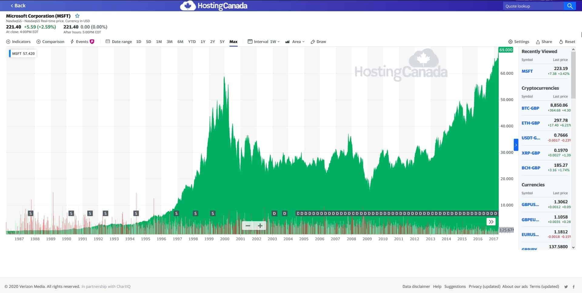
The first thing you’ll notice is that Microsoft had a pretty massive spike in closing stock value just before the end of the year 1999.
As you can see, it plummeted really quickly after that in 2000, probably after people realized the Y2K bug was dealt with by the hard work of thousands of people across the globe.
Another thing you’ll notice is a significant drop in march of 2009.
This was mostly due to the dismal reception of Windows 8 and the surface (including a $900mil write-off of unsold Surfaces), both doing worse than expected, making people lose faith in Microsoft and leading to a massive sell-off which lead to a closing price of 11% lower and a total of $34Billion wiped off their value. That’s a lot.
Anyway, the point is that there are always some major unforeseen circumstances that can majorly affect stock, but for the most part it tends to be relatively stable. Looking at the chart above, you can probably already see trend lines and channels of high and low closing prices.
Identify the Channels
Identifying these channels is the key to making bank in the stock market. In February 2021, the stock price of Microsoft has skyrocketed, most probably due to the pandemic. It’s likely that we’re going to see that trend reverse itself as the pandemic is slowly dealt with, and a vaccine becomes available.
That being said, with so much moved to the digital arena, it’s likely that the average lows will be higher than they were before the pandemic. So would it be a good time to buy stock in Microsoft in this time period? Maybe, but it would be quite risky and the trend going up probably won’t last more than a few months and won’t move too dramatically.
Stock Trading Tools
Alright, so you think you have a good idea of stocks and stock charts, so where to go next? Well, there are some interesting tools you can work with.
TradeHero
While you can trade with up to $50 on the stock market, the value of TradeHero is that you can load up a dummy account with up to $100k and start trading.
It’s a nice way to cut your teeth in the stock market without losing a massive amount of your own money. Just don’t kick yourself too much when that trade you made in the app does really well and you wish you had done the same in real life!
However, don’t forget to protect yourself while trading, invest only as much as you are ready to lose.
QuestTrade
QuestTrade is an online brokerage platform that’s perfect for Canadians, especially in terms of low fees. We’ve done a nice QuestTrade review if you’re interested in checking it out.
Finviz Stock Screener
This is a stock screener that is made for all levels of stock traders, from beginner to professionals. While there is a free version of Finviz Stock Screener, the $25/month is really the one you want to get for the full features.
Conclusion
As you can see, stock trading is interesting, and things vary a lot from one stock trading platform to another. The most important thing to remember is to take it slow and don’t put all your money into stock trading when you’ve just begun. It is a risky business, akin to gambling, so our bit of advice? Don’t ever put more money into it than you’re willing to lose.
Other than that, we’d also suggest you keep a diverse portfolio, and never put more than 10%-20% of your investments into one stock. If you do, and it fails, you’ve lost everything with nothing to fall back on, so better to play it safe, especially with something as volatile as stocks.
Understanding stock charts is especially important when you are day trading, take a look at our guide if you are interested in how to make money day trading.