Advertising disclosure
Hosting Canada is community-supported. We may earn a commission when you make a purchase through one of our links. Read Disclosure.
Image Optimization for Minimal File Size
Your website’s performance is dependent on several factors ranging from the specific web host you choose, over following website accessibility guidelines, to the image file sizes you use.
Formatting them for proper size, however, can reduce quality due to the modifications you make. The good news is that you can maintain optimal image quality and get the right size with a few techniques and tricks.
What is Image Optimization?
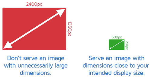 Web pages can experience a significant slowdown when large images are present. This can reduce loading times and make the overall experience subpar for your site visitors.
Decreasing the file size is image optimization. You can use a script or a plugin for this.
This then results in faster loading times for your pages. Lossless and lossy compression are the two most common optimization methods.
Benefits of Image Formatting
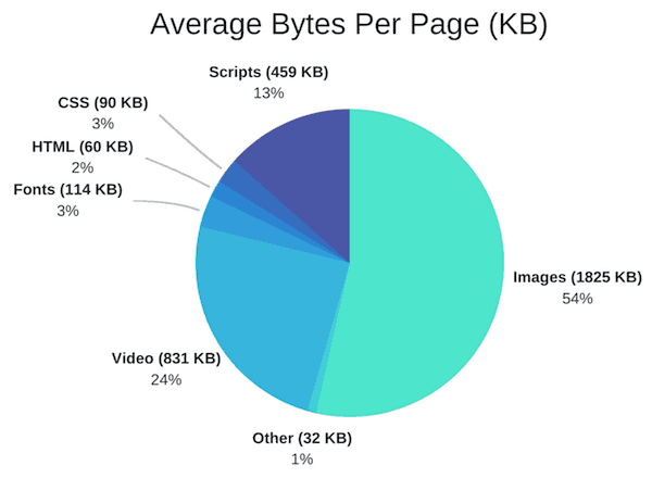 It is estimated that approximately 54 percent of the total weight of a webpage is due to images.
When you are working on website optimization, your images should be your first task because of this. The benefits of image formatting include:
- ☑️ Improved page loading speed
☑️ It is faster to create backups
☑️ Less server storage space is required
☑️ Improved SEO with the right SEO plugin
☑️ Less bandwidth is used
How to Improve Performance with Image Optimization
The goal is to evenly balance acceptable quality and the lowest possible file size. There is more than one way for you to do this. Before uploading, compressing your images is a common option. You can use a tool or a plugin for this purpose (here are a few).
It is important to consider the type of compression and file format that you use. The right combination makes it possible to decrease the size of your image by up to five times.
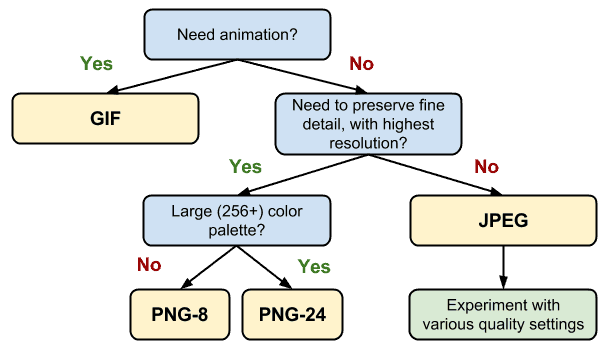
Experiment with different file formats and compression types to determine the best combination for your needs.
Pick the Best File Format
To choose the best file type, it is important to know which are available. These are the most common:
- ☑️ JPEG: This type utilizes lossless and lossy optimization. You can strike a solid balance of file size and quality.
☑️ GIF: This is ideal for animated images. You can only use lossless compression. It only uses 256 colors.
☑️ PNG: This type tends to have a bigger file size, but the images are higher in quality. You can use lossy or lossless compression.

There are other options, but these are among the most common and easy to work with. Other options include JPEG XR and WebP. Not all browsers support these two, so be aware of this.
They can be a viable choice, however. For example, compared to a comparable JPEG image, there is a 30 percent file size reduction with WebP, on average.
Due to the lack of universal support for these two options, your application will need additional logic on your servers or application to provide the appropriate resource:
- ☑️ Image optimization is a service provided by some CDNs, including WebP and JPEG XR delivery.
☑️ Certain open-source tools automate the conversation, optimization and serving of appropriate assets.
☑️ To detect the client, provide the best image format available and check the supported formats it is possible to add additional application logic.
Size vs. Compression Quality
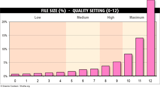
Low compression tends to give a higher quality, but the files sizes are typically larger. The opposite is true with high compression. The files are smaller, but the quality tends to decrease.
Ideally, you want a total of one to two MB for your webpage’s overall weight. So, consider how many images you need to use and divide this number by about 1.5. This gives you the size per image that allows for the best loading speed.
Lossless vs. Lossy Optimization
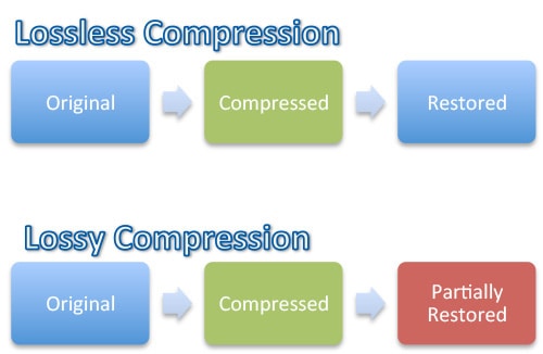
These are the two types of compression you will use. It is important to understand what they do:
 Lossless
This compresses data and it is a filter. Before rendering the image, it must be uncompressed.
However, quality is not reduced.
There are several tools that perform lossless compression.
Lossy
This eliminates some data and it is a filter. Be mindful of how much reduction you do because it will degrade the image. You can use different image editors and tools to adjust the image’s quality settings.
The optimal configuration of either lossless or lossy configuration depends on your own criteria, such as the tradeoff between artifacts introduced and file size, and the image contents.
There is not a single universal setting that applies to all images. Ultimately, you want to play around with different images to see which works best.
Resizing Images to Scale
Thanks to responsive pages on sites, such as WordPress, you will get several file sizes in your media library. Your browser can choose the size that is best and download it. The size the browser chooses is based on the device’s resolution.
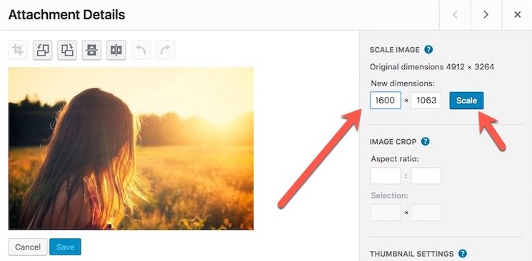
The original file remains untouched and retained. You can use plugins to avoid saving the original to conserve disc space if you prefer.
Replacing and Eliminating Images
Do you need all of the images on a webpage? If not, remove those that are unnecessary. However, if all are pertinent to the content, consider replacing the larger or lower quality images with better options.
In some cases, web fonts and CSS effects can take the place of images while still providing a nice visual aesthetic on the page. With web fonts, nice typefaces can help to improve usability and provide a more tailored look to your pages.
It can also improve your readability and branding. Just ensure that you can still easily search, select and resize the text without it having readability issues.
CSS effects include elements, such as shadows and gradients. These too can further branding. Animations can provide visual appeal on your webpage at every zoom level and resolution. Compared to image files, these are a fraction of the bytes.
Raster vs. Vector Images
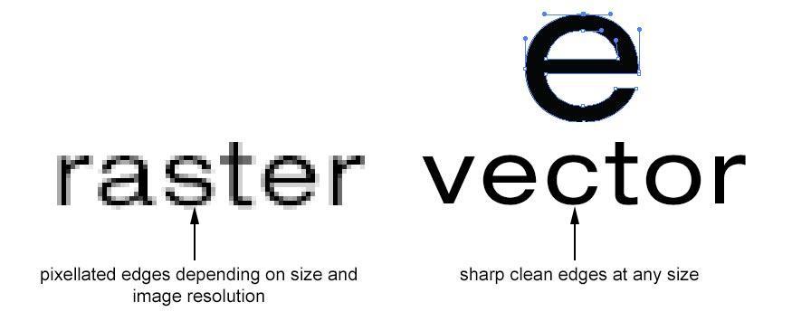
Raster and vector are two of the primary image file types. Pixel-based programs, a scanner or a camera are used to create raster images.
These are widely used on the internet and more commonly used. Vector software is used to create vector images. These are common for images that go onto physical products, and in engineering, CAD and 3D graphics.
Vector images are resolution- and zoom-independent. When geometric shapes are involved, vector is ideal. When images are complex and have a wealth of details and irregular shapes, raster images are preferred.
Raster graphics encode each pixel’s individual values within a rectangular grid to represent an image. Vector graphics represent an image using points, lines and polygons.
High-Resolution Screen Implications
It is important to distinguish between the two different pixel types, which include device pixels and CSS pixels. Multiple device pixels can be present in a single CSS pixel. The detail on the screen becomes finer with more device pixels.
To take full advantage of the higher device pixel counts, the image assets must have more detail.
![]() This task is ideal for vector images since they can produce sharp results when rendered at any resolution.
This task is ideal for vector images since they can produce sharp results when rendered at any resolution.
Since raster images use a per-pixel basis to encode image data, they are more challenging. This is while raster file sizes increase as the pixels increase.
So, high-resolution screens need high-resolution images to reap the benefits. Vector images are best for high-resolution screens since they always provide sharp results due to being resolution independent.
Just remember that regardless of the resolution, the image optimization techniques are the same.
Optimizing Vector Images
Scalable Vector Graphics (SVG) are supported by all modern browsers.
This is ideal for two-dimensional graphics and the format is XML-image based. SVG files can be created by hand using the text editor that you prefer or with most vector-based software types.
To reduce the size of SVG files, they should be minified. GZIP should be used when compressing SVG files.
Optimizing Raster Images
A grid of pixels makes up a raster image. The individual pixels are on a two-dimensional grid. For example, a sequence of 10,000 pixels makes up an image of 100 by 100 pixels. Every pixel encodes transparency and color information.
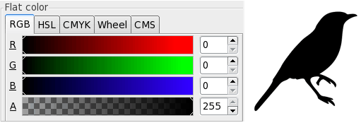 RGBA values are stored by each pixel. These include:
- ☑️ Red channel
☑️ Blue channel
☑️ Green channel
☑️ Alpha (transparency) channel
256 shades (values) are allocated internally by the browser. Per channel, this translates to eight bits. Per pixel, this is four bytes. This makes it possible to calculate the file size using the grid dimensions. It does not take much for the size of the file to become very large.
So, to reduce the size of the image file, there are a few strategies:
- ☑️ Reduce the image’s bit-depth. You can do this by using a smaller color palette.
☑️ Optimize the data that the individual pixels are storing.
Tools and Parameter Tuning
There is no perfect image tool, set of optimization parameters or format that will work for every image. The image contents, and its technical and visual requirements, will determine which you should use.
Once you find a good setting set, you can use it for similar images in the future to save time. However, make sure that you never assume that the same settings should be used to compress all images.
Learning about a few common tools can aid you in making the right choice. These four are among the most frequently used:
- ☑️ Gifsicle: This allows you to optimize and create various GIF images.
☑️ Optipng: This is used to allow for lossless PNG optimization.
☑️ Jpegtran: This one allows you to optimize JPEG images.
☑️ Pngquant: This is used to allow for lossy PNG optimization.
Delivering Scaled Image Assets
There are two primary criteria to consider when you are performing image optimization:
- ☑️ Optimizing an image’s total number of pixels.
☑️ Optimizing how many bytes are necessary to encode each pixel in an image.
 The size of your image file breaks down to total pixels multiplied by the total bytes necessary for individual pixel encoding. This is it.
Keep this in mind when you are working to determine the optimal size for the image files on your website.
Because of this, the most effective and easy way to optimize images is to make sure that you are not shipping more pixels than you absolutely need to show the asset in the browser at its intended size.
So, do not just rely on your browser to rescale images. This can cause them to be displayed at a lower resolution. It also uses a lot of extra CPU resources.
It is generally not possible to guarantee the exact display size for every single asset delivered. However, it is important to make sure that you keep all unnecessary pixels to a minimum.
It is also imperative that you deliver your large assets as close as you can to their display size.
Image Optimization Checklist
All of the information here allows you to optimize your images so that your webpages are faster. You will still be able to use beautiful images, but they will not cause a significant slowdown with your page’s loading times.
This will make your visitors happy and improve the overall function of your website. Consider the following checklist points when you are optimizing your images:
- ☑️ Consider vector formats since they work for high-resolution and multiple devices (scale and resolution independent).
☑️ All SVG assets should be compressed and minified. This removes unnecessary metadata.
☑️ For raster formats, play around with the optimal quality settings. This can save you a significant number of bytes.
☑️ For each asset, figure out your functional requirements and pick the best format for raster images.
☑️ Automate whenever you can to ensure consistent image optimization.
☑️ Serve scaled images so that the natural image size and the display size are as similar as possible.
To sum it up, there is both a science and an art to image optimization. The algorithms and techniques that are highly developed serve as the science.
The lack of definitive answers regarding individual image compression is the art. Ultimately, you should play around and experiment. This allows you to make the best choice for your image files and how they contribute to your webpage speed.
With the rising popularity and sophistication of third-party website builders like Wix, it’s easy for designers to get sloppy but stay focused on developing and maintaining good image optimization processes whether slapping down a template or building a site from scratch.
References and image credits:
- PicupMedia.com
- Computing.HomeDNS.org
- CognitiveSEO.com
- StackOverflow.com
- EngineThemes.com


