Advertising disclosure
Hosting Canada is community-supported. We may earn a commission when you make a purchase through one of our links. Read Disclosure.
Wix vs Squarespace Comparison
 Choosing a website builder is an important decision, especially if you want a professional-looking site without learning to code. In this Wix vs Squarespace review, we compare two of the most popular website builders to help you decide which one is right for your needs.
Both platforms make it easy to build a beautiful website, but they take very different approaches. Wix focuses on flexibility and customization, while Squarespace prioritizes simplicity, structure, and polished design. Below, we break down their features, ease of use, and ideal use cases so you can make the right choice with confidence.
Wix vs Squarespace: the Lowdown
In one corner we have Wix – the feature laden heavy weight that promises itself as the best place to create the website you want.
In the other corner we have Squarespace – the simple to use software that allows you to look like an expert right from the start.
I give the slight edge to Wix.
It is possible to use Wix almost as well as Squarespace for what it does best – building within a template to create a beautiful website. But it is not possible to use Squarespace for what Wix does best – completely customizing a website from a 100% blank canvas.
With that being said, there is nothing wrong with using Squarespace. If your goal is to create a website that looks professional and aesthetically pleasing in under a day, then Squarespace is my choice, barely edging out Wix.
Before jumping into the finer details of what makes them different, it’s important to talk about what they have in common.
Wix vs Squarespace: The Similarities
Both Wix and Squarespace are amazing website builders. The point of website builders are to allow someone to build a website quickly by completely removing the need to know how to code.
Most good website builders, including both Wix and Squarespace, handle every aspect of owning a website. This usually comes at more of a cost — as they remove the need for web hosting services, buying a domain name from a domain registrar, design interface, e-mail addresses, integrations, privacy, and everything else under the sun.
Wix and Squarespace are as direct of competitors as two companies can be as they serve the same demographic. If you need or want a website and don’t want to figure out the nitty-gritty behind website development then you’re looking to either of these companies. They both allow you to build a beautiful website with minimal effort.
[ninja_tables id=”2563″]Who Wix is for
I won’t get into all of the dirty details yet, but right of the bat, you should use Wix if you have a bit more patience to take the time to master the functionality of Wix and if you still want the seamless drag-and-drop interface.
Once Wix is mastered, it is a powerful tool that will allow you to turn a blank canvas into a work of art.
A fully customized website with fantastic customer support and a great community to help you build a website is what Wix offers. There is a learning curve but the options at your fingertips are almost endless.
Wix is for people who want to create a website that is unique to them. Building inside a pre-built template isn’t as important to these people. Wix users are willing to mess around with the builder to get the hang of it.
Who Squarespace is for
If you’re looking for a way to build a clean and simple website within a template as quickly as possible then Squarespace is the right website builder for you.
It is easier and quicker to create a beautiful finished product with Squarespace than anywhere else. What it lacks in features it makes up for in ease of use and finished product.
You should use Squarespace if you want to drag-and-drop but you also want your website built as soon as possible.
A high priority for you is that everything looks sleek, professional, and uniform and you don’t want to fiddle around with a bunch of settings to make it look that way.
Squarespace is extremely intuitive and will create an aesthetically pleasing and professional website quickly. The issues you run into are when you decide you want more than what Squarespace offers. If a beautiful and simple website within a pre-built template is your goal without wanting to overcomplicate things, then Squarespace is for you.
Drag-and-Drop
Drag-and-drop builders are pretty self explanatory.
You take an element you want to build on the page and drag it to where you want it.
This is one aspect where Squarespace and Wix start to diverge. If you base your decision off one portion of this review this would be a good section to choose. Squarespace only lets you drag that element into a preset grid while Wix allows you to drag any element anywhere.
This might make you think that Wix is the better option seeing as how it lets you do whatever you want. But that just isn’t the case—it still depends on what you want or what you need.
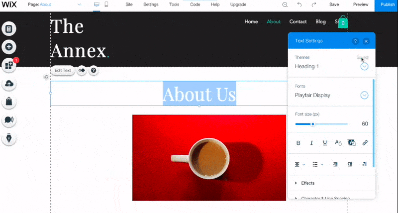
With the freedom of Wix comes the opportunity to mess up aspects of the website you’re building. Below is an example of the issues that usually pop up in Wix. When we change the font size of one section – the header logo is inexplicably enlarged as well.
The design interface of Squarespace is as simple as it gets. You take an element you want to build on the preset template and it into a preset position it can be placed. The whole process is standardized to ensure your website stays cohesive and stylized.
Freedom or Lack of Freedom
When it comes down to it, Squarespace vs Wix can be separated by one thing: the template.
With Squarespace – stick to the template and you will have a fantastic website. With Wix – you can stick to a template and make a nice website but the greatness comes from meandering away from a template.
Squarespace just has the best templates

With Squarespace, it is absolutely possible to pick a template, change all the text and pictures in under an hour and then be done with your website. It’s so easy with their templates to make a simple and truly beautiful website.
The problem with Squarespace is going beyond that template. There are other elements that can be added and moved around. Once you mess with the template you are opening yourself up for trouble.
This is where Wix steps in.
A ridiculous amount of possibilities is what you get with Wix. The list of elements to add is staggering.
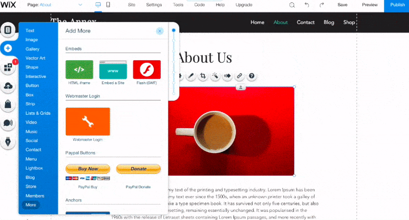
So. Many. Options.
While this allows for the ability to customize the webpage in any way possible, it can also be overwhelming. Menus and small icons are in every nook and cranny of Wix. Looking for an option to edit an aspect of the page may appear in a spot you would never think to look.
Here’s the deal on Wix vs Squarespace: when it comes to Wix, think freedom. When it comes to Squarespace, think efficiency.
Customer Support and Knowledge Base – Winner: Wix
Both software have a robust knowledge base where it is possible to find anything that might need more explaining. Wix does have a more responsive customer support than Squarespace but it isn’t by much.
 Since Squarespace’s greatest strength is being simple yet powerful there isn’t that much you would need to use the knowledge base for. Yet, if you need it – it is all there.
The knowledge base comes in handy if I can’t find certain settings or elements. All it takes is a quick search in the knowledge base to be pointed in the right direction.
The help center for Wix is a little more relevant than Squarespace’s. Since Wix is more complicated and has so many feature the knowledge base needs to be great.
Luckily, it is. The Wix Help Center has an explanation for anything that could cause confusion or seems to be missing.
The question does arise – Do I want to be using the knowledge base this much? I found myself not needing Squarespace’s knowledge base very often.
SEO – Evenly Matched
 Wix and Squarespace are evenly matched when it comes to SEO. This should not play a role in your decision to use either of them.
One situation that might accidentally tip your opinion towards Squarespace is that Wix has a horrible SEO reputation. The reason is that pre-2016 Wix was built on Flash technology. In 2016, Wix fixed all of this and is now on even ground with Squarespace.
SEO is fine on Squarespace and Wix. Their SEO features include auto-generated sitemaps as well as customizable page titles and meta descriptions. Both options allow you to use various SEO tools. If you plan on blogging and optimizing SEO then either will work for you.
The only time Wix and Squarespace should be avoided is if you really plan on going all out with SEO. This usually isn’t the case for people that are using website builders in the first place.
Blogging – Winner: Squarespace
![]() Another wash between the two competitors. Blogging is straightforward and effective with both options. All of the blog functionally you would want or expect is present in Squarespace and Wix.
Another wash between the two competitors. Blogging is straightforward and effective with both options. All of the blog functionally you would want or expect is present in Squarespace and Wix.
One leg up Squarespace has is the ability to schedule posts for publishing later. Squarespace has features that include liking, comments, and a sharing icon. You can also enable an RSS feed and set up a podcasting integration.
The blogging pages on Wix are kind of the opposite of the rest of the service. Wix blogging is surprisingly simple. The software offers a structured text editor that allows you to add images. Wix still offers everything you could want as a blog owner.
It allows authors, categories, drafts, cover photos, view counters, avatars, like counters, and read time estimates.
Pricing – Winner: Wix
The pricing of both services are relatively similar. The slight leg-up would go to Wix here. The price point most users should choose at Wix is $14 a month and the price point at Squarespace is $18 per month. Even though these prices are “monthly” – this is for annual billing.
The only difference is that Squarespace does offer an opportunity to actually pay monthly whereas Wix does not. That privilege does come with a price tag – to pay monthly, the original $18 dollars a month jumps to $26 a month.
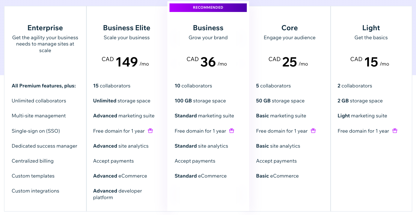
The full pricing structure of Wix is basically meant to shove you towards their Unlimited option at $14 a month. There is an option that offers more perks that can be seen below.
Squarespace’s pricing doesn’t offer many options unless you’re looking for an e-commerce option. For general websites there are two options.
I wouldn’t let the price points impact your decision if I were you. I would base my decision on what is detailed above.
Conclusion
Here’s the thing – you can’t really go wrong with using Wix or Squarespace.
I can confidently say that one is not better than the other. If there was only one takeaway, it is that they are for two different types of user.
It isn’t about which one has better pricing or which one can offer better SEO. When going to a website builder, you have to decide what you want when it comes to your website building.
This is more about your preference for building a website than which service is better. Once you figure that out for yourself, you will be able to pick one or the other.
Good luck!


